Date
2026
Client
DOSE
Industry
Fitness & Wellness
Visual Identity
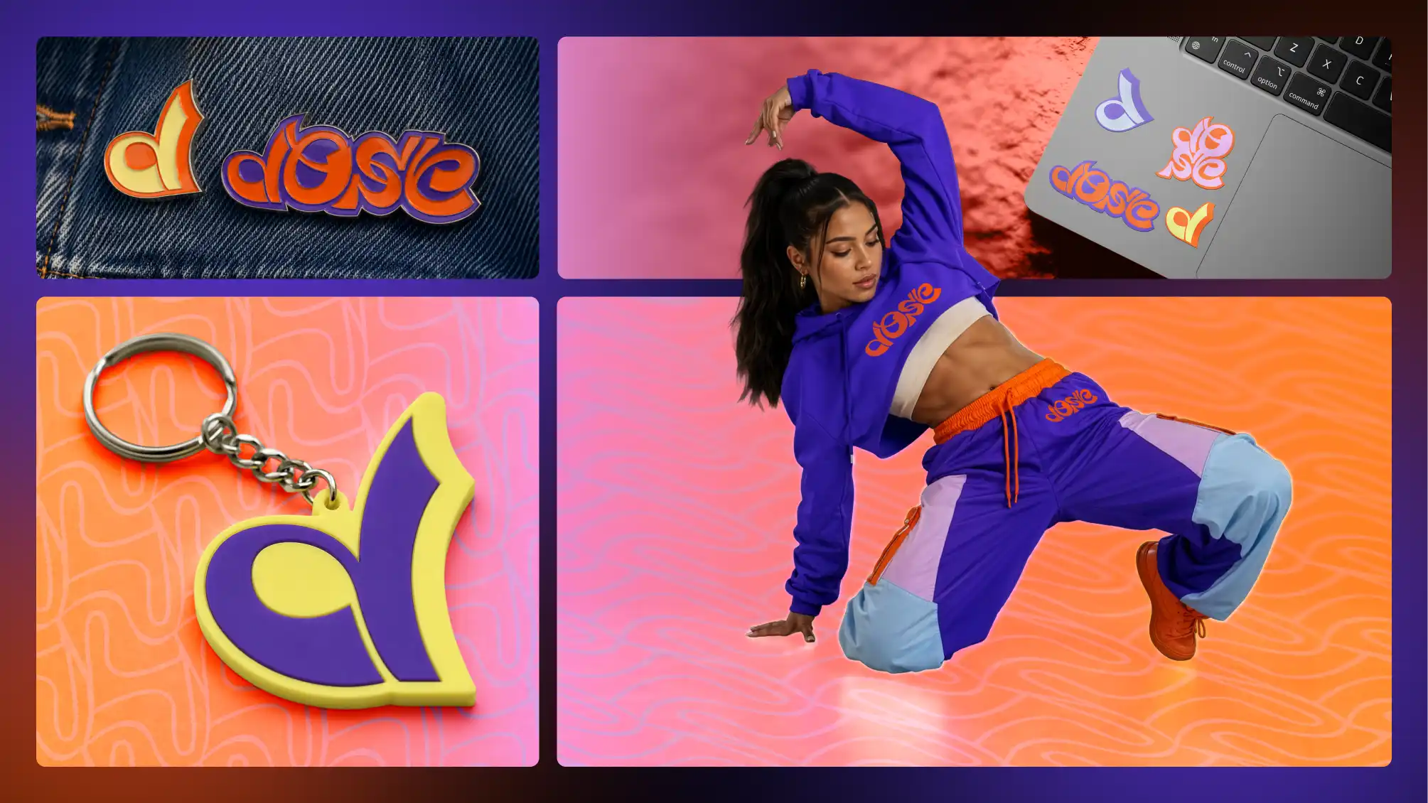
To create an identity that felt energetic and expressive without losing structure.
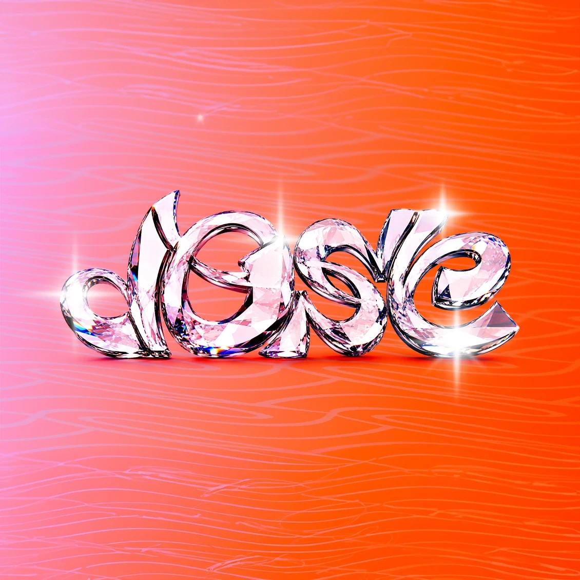
DOSE wasn’t starting from nothing. There was a strong community with an even stronger sense of purpose and feminine power. But for years, the brand had been built with whatever tools were available: Canva graphics, one-off visuals, and design choices that solved the immediate need but never fully captured the world the founders were creating. The challenge was to create an identity that felt energetic without becoming generic. The result is a flexible visual system built around movement, color, rhythm, and recognition, designed to carry the DOSE experience across digital, physical, and community spaces.
Branded Merchandise
Logo, color, and rhythm working as one system.
Because DOSE is rooted in movement, the identity needed to feel active from the start. The logo system uses fluid, rounded forms that feel kinetic without becoming chaotic. High-energy color, flexible patterns, and bold compositions create a visual language that feels confident, playful, and instantly recognizable. The system gives DOSE room to be expressive while still creating consistency across every touchpoint.
Identity System

Brand Applications
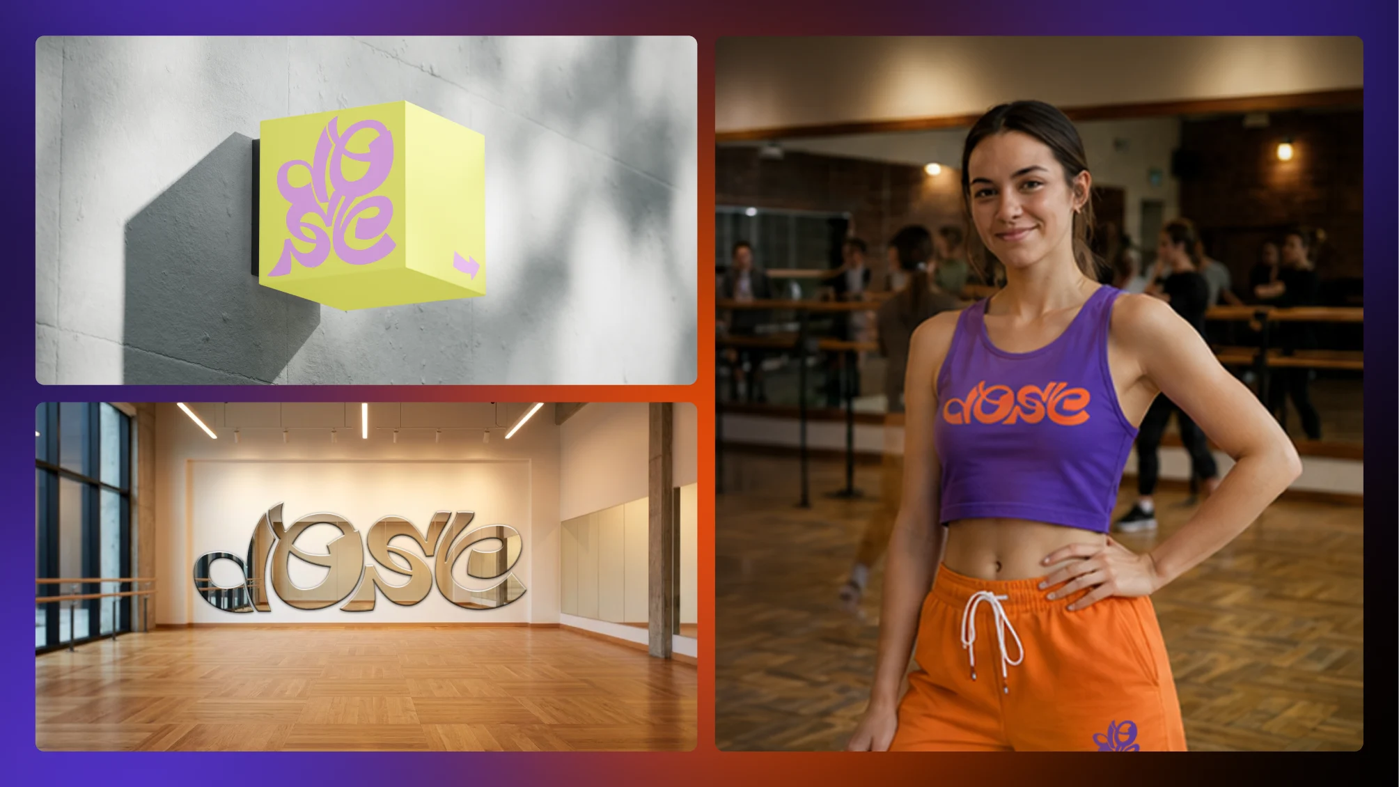
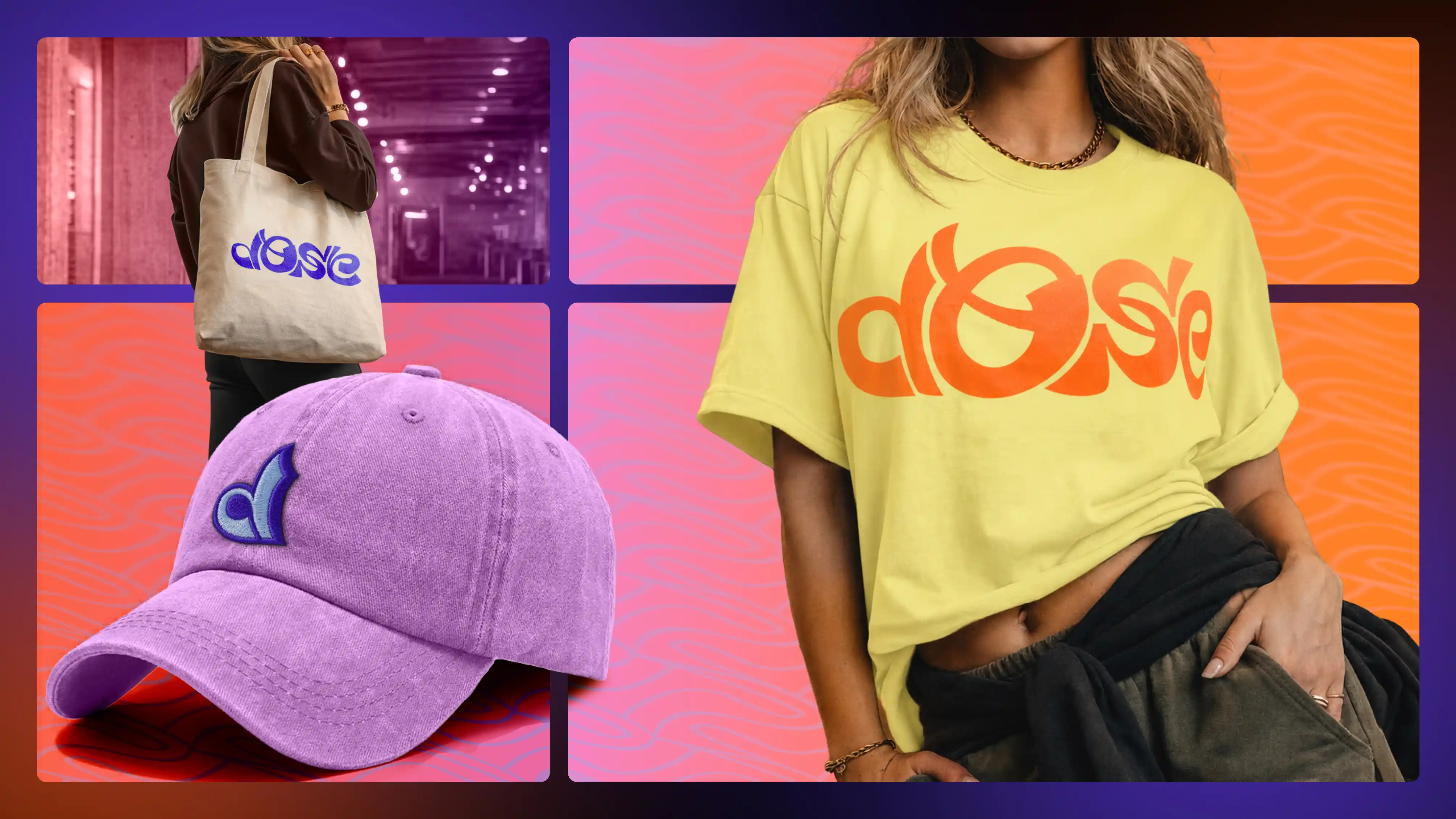
From apparel to merch and physical environments.
The brand was designed to live beyond a screen. From apparel and merchandise to signage, social graphics, studio materials, and environmental moments, the system gives DOSE a visual presence that can show up anywhere without losing itself. Every application reinforces the same feeling: movement, confidence, community, and energy.

Latest projects